
Flowers by Color
Every flower color this shop carries, organized as its own collection — white, cream, pink, red, blue, purple, green, orange, yellow and black — so palette shopping starts from the hue rather than the species. Each color page defines its stops precisely (where the family drifts, which reads are adjacent) and states bloom, greenery and stem materials per listing. Buy by color here, or by bloom at the flowers hub below.
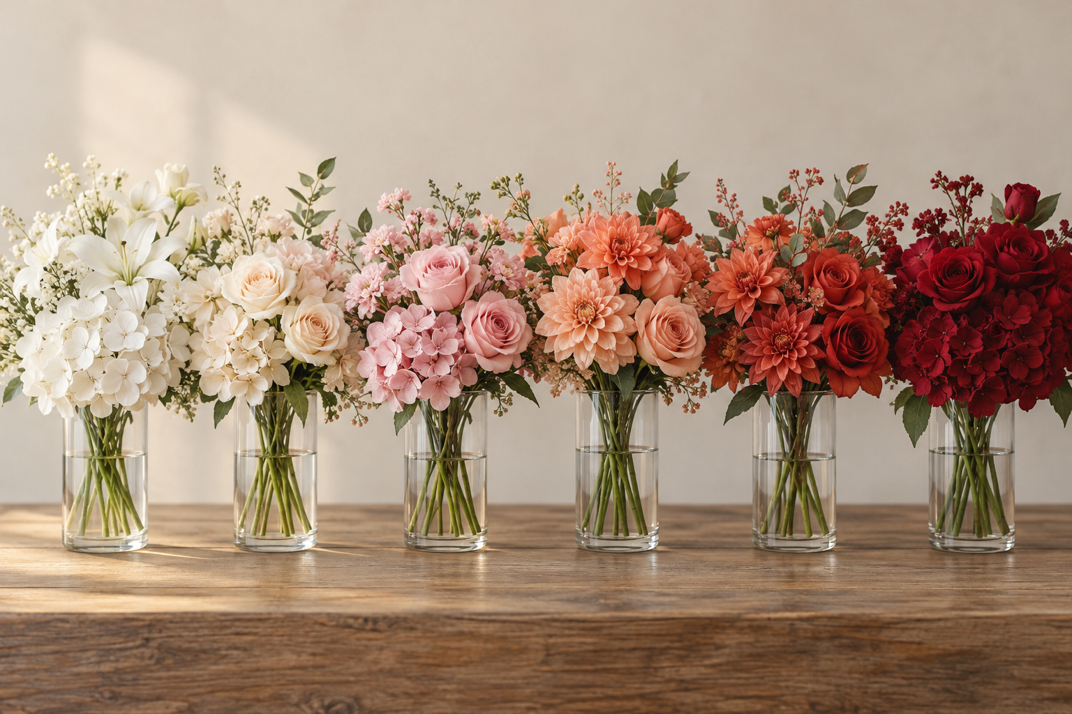
Quick answer: Three rules run every color: order one dye lot per build (fabric drifts between batches — purple most visibly), pair adjacent stops rather than distant ones (blush plus soft pink reads depth, blush next to magenta reads mistake), and choose saturation by viewing distance — pastels and deep tones at arm's length, vivid stops for porches and parties. Eleven colorways, each with its stops defined.
The Eleven Colorways
White — the universal base · Cream — the warm neutral · Pink — romance in five stops · Red — the attention color · Orange — harvest and festival warmth · Yellow — the mood-lifter · Green — blooms that behave like plants · Blue — botany's rarest color · Purple — the royal range · Lavender — the calm register · Black — the design statement
The Three Rules That Run Every Color
- One dye lot per build. Fabric color drifts between production batches in every family — white toward cream, pink between stops, purple most visibly of all. Every stem destined for one room or one event orders together, and the first head gets a daylight check against the target before the full build.
- Adjacent stops, not distant ones. Within a color family, two neighboring stops read as depth (blush plus soft pink); distant stops read as a mistake (blush next to magenta). Every color page above defines its stops precisely for exactly this reason.
- Choose saturation by distance. The closer guests stand, the more muted the stop should be — bright saturations read designed from across a room and synthetic at arm's length. Pastels and deep tones carry close-range work; vivid stops carry porches, parties, and distance.
Choosing by Room and Light
Why a Color-First Catalog Is Rare (and Worth It)
Look across the major faux-flower retailers and nearly every catalog is organized the same way: by species. Cherry blossoms here, hydrangeas there, roses and peonies in their own aisles — the nursery's structure, copied online. Color-first shopping exists in the wholesale trade's own buying guides, which tell retailers to settle color before anything else when selecting stock, but almost none of the retail catalogs let a shopper do the same. A color axis like this one flips the burden: instead of opening eleven species pages hoping one carries your exact dusty blue, you open one blue page and see every species that ships in it. For palette-matched work — a wedding built around one accent, a room staged to a paint chip — the species-first catalog makes you do the sorting that the color-first catalog has already done.
One adjacent demand the species catalogs generate: tutorials for dyeing artificial flowers at home keep a steady audience, because shoppers who cannot find the exact tone in a species-first store try to make it. Dyeing works, but it is the expensive route to a color you can simply buy — dye lots vary, dip results patch, and a mis-dye cannot be returned. Search the color axis first; treat dye as the last resort for a stop no catalog carries, after — not instead of — checking the eleven colorways here.
When the flower comes first instead of the color, start from the species side: the full flowers hub organizes the same catalog by bloom family, from hydrangeas to orchids.
Frequently Asked Questions
How do I match artificial flowers to my wall color?
Order one head of the candidate colorway and check it against the wall in daylight and again under evening lamps — fabric shifts between lights more than paint does. Then order the full build from the same batch as the checked head. Skip the single-head step and you are matching a photo to a wall, which is where most mismatches begin.
Which flower colors go together?
The reliable pairings: adjacent families (lavender with purple, cream with white), one saturated accent over neutrals (a single red or blue stem in white and green), and gradient monochrome (three stops of one family). The unreliable ones: neighboring-wheel brights at full saturation (orange with yellow needs a greenery break), and two distant stops of the same family in one build.
Do all colors of fake flowers fade equally?
No — white yellows first (brighteners degrade), pastels flatten next, and saturated warm colors (reds, deep oranges) hold longest. Purple and blue shift flatter rather than lighter. The UV-rated lines in the outdoor collection extend every family's outdoor life; interiors hold all colors for years.
What is the most popular color of artificial flowers?
White — the wedding default, the hotel-lobby standard, and the base of more palettes than every other color combined — followed by pink for the home market and green as the foliage layer that every build buys regardless of its blooms. The rarest shopping intent is black, reserved for Halloween, gothic weddings, and editorial rooms.
Can I dye artificial flowers to an exact shade instead?
Dip-dyeing works on light silk tones, but batch results vary and a mis-dye is unreturnable — it is the last resort, not the shortcut. Check the eleven colorways first, including adjacent stops (a half-step off your target usually reads as depth, not error); dye only for a stop no catalog carries, and test one stem before the batch.