
Wedding Color

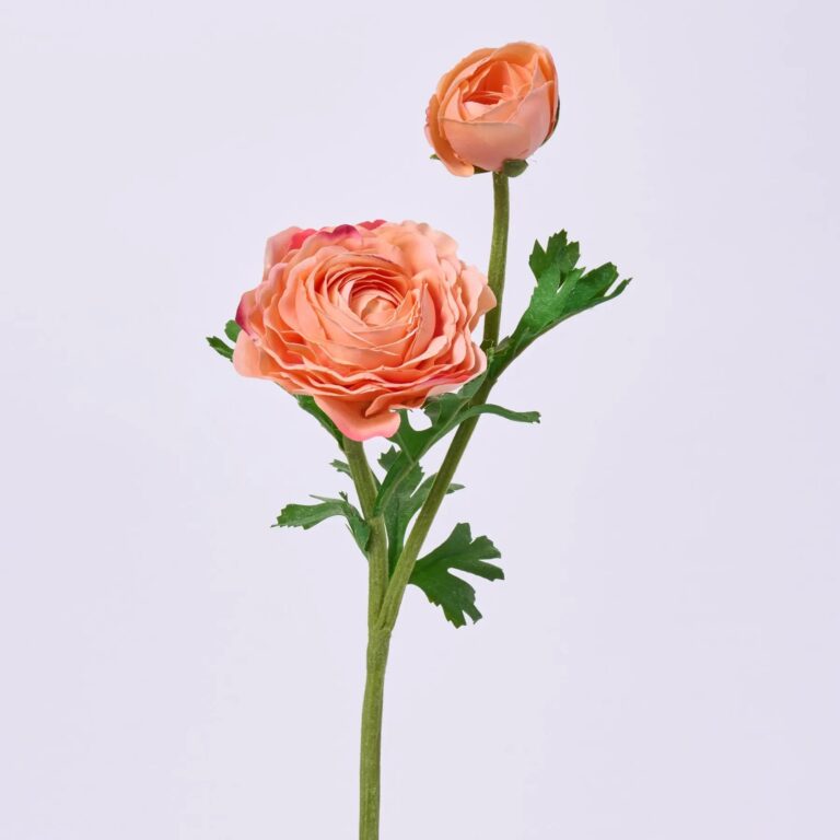
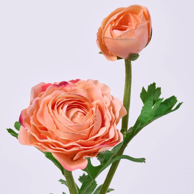
23″ Real Touch Ranunculus Spray – Blush
Price range: $20.00 through $21.00Ranunculus spray in coral. Measures 23″ long. Perfect for filling vases, wreaths, and seasonal arrangements.
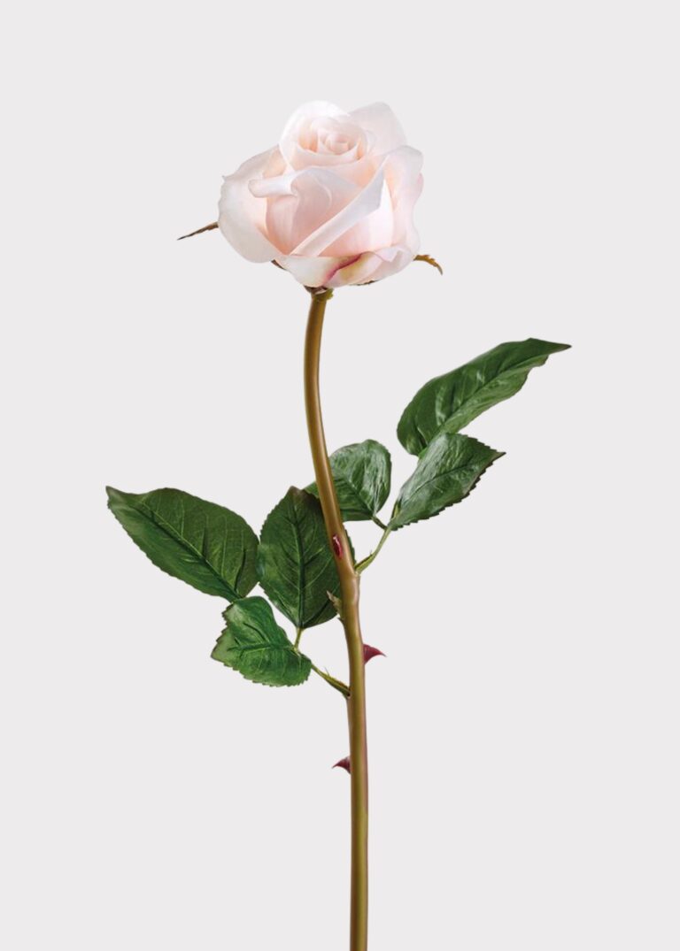

23″ Real Touch Rose Stem – Blush
$12.00Rose stem in blush. Measures 23″ long. Wired stems shape and cut easily. Mix it with other botanicals for a full, layered arrangement.
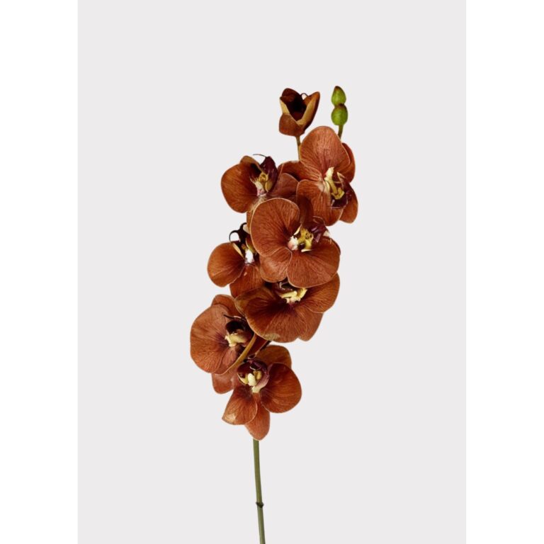
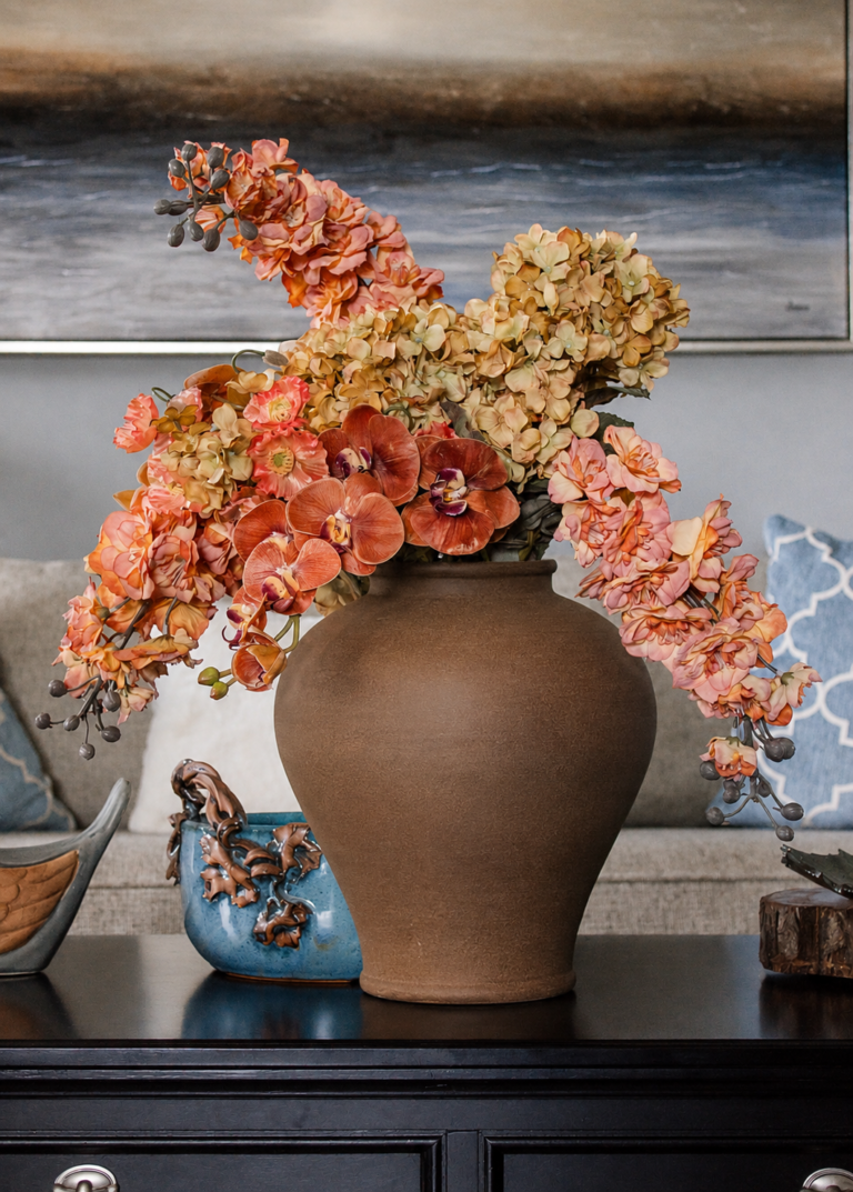
31″ Real Touch Orchid Stem – Burnt Orange
$32.00Real Touch orchid stem. Measures 31″ long. Wired stems shape and cut easily. A no-fuss way to keep vases full year-round.
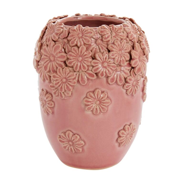
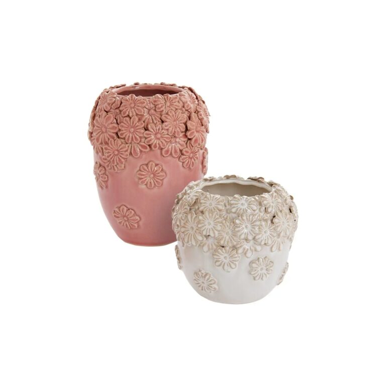
Blush Ceramic Vase
$29.00Ceramic pansy vase. Pairs with fresh cuts or our forever florals. Pair it with more stems from Evercombe.
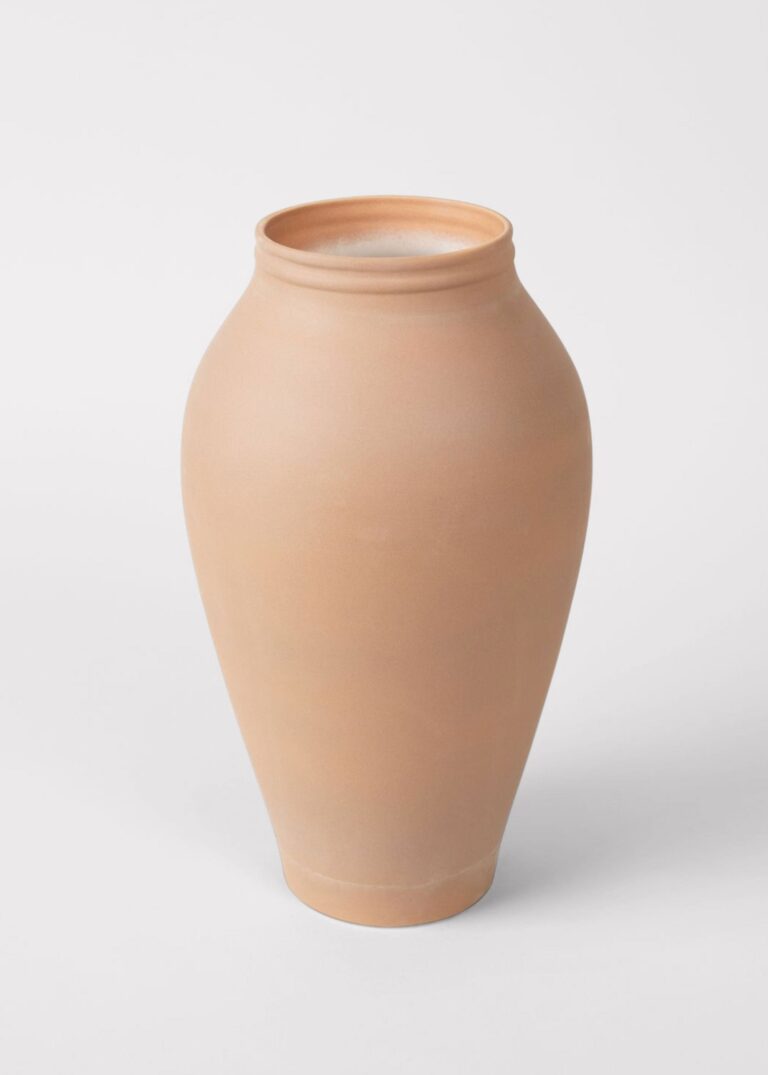
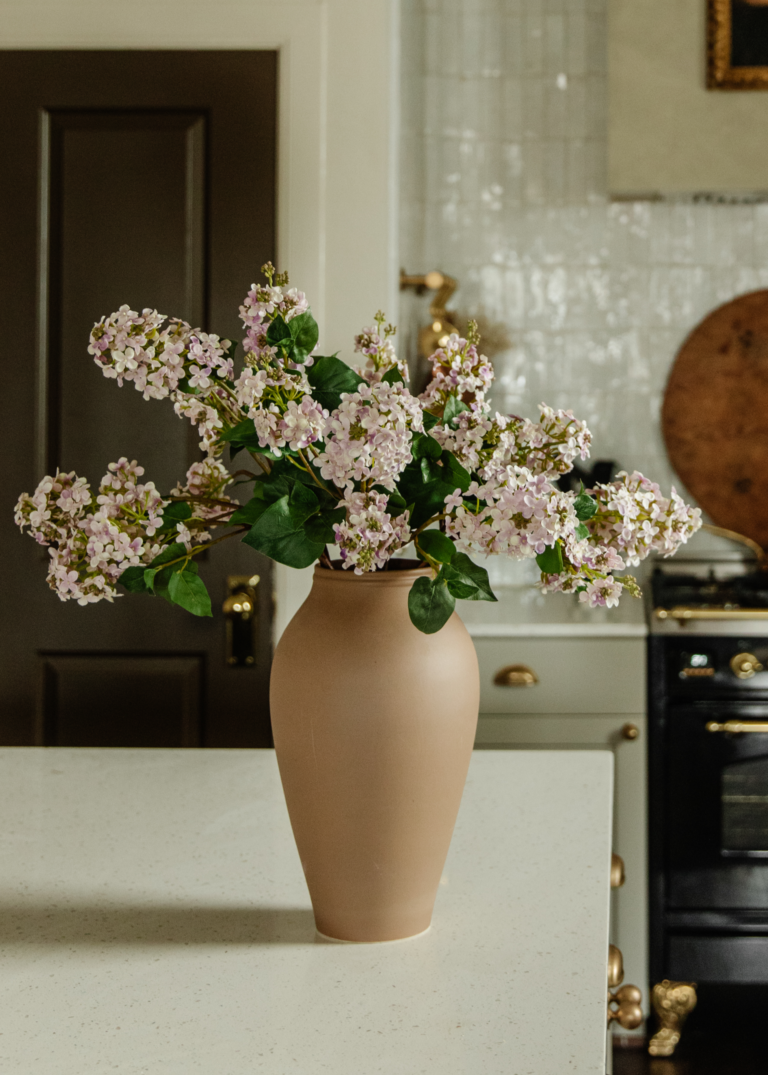
Burnt Orange Ceramic Tall Vase – 14″
$42.95Ceramic vase. Measures 14″ tall. Style it solo or load it with stems for a full display.
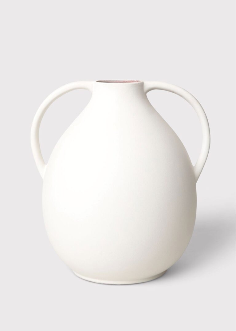

Burnt Orange Ceramic Tall Vase – 14″ 2
$98.00Faux vase. Measures 14″ Tall x 11.75″ W. Pairs with fresh cuts or our forever florals.

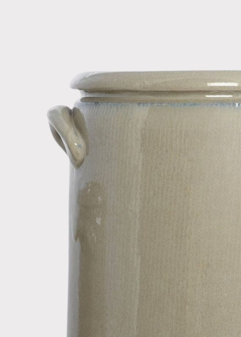
Burnt Orange Ceramic Tall Vase – 9.25″
$68.00Faux vase. Measures 9.25″ Tall x 7.75″ W. Pairs with fresh cuts or our forever florals.

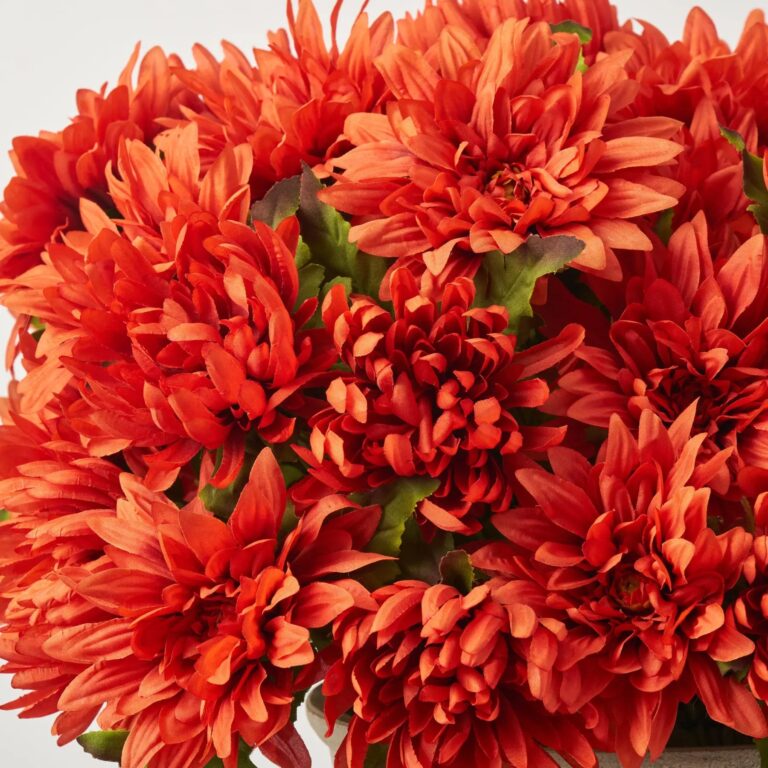
Dahlia & Mum Artificial Urn in Urn – Burnt Orange
Dahlia & mum urn in burnt orange. A finished centerpiece that needs no watering.
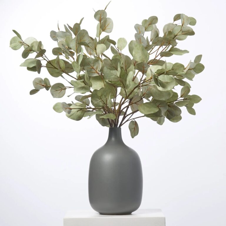

Eucalyptus Faux Vase in Glass Vase – Sage Green
$289.00Faux eucalyptus vase. Measures 26″ L x 26″ W x 28″ H. Arrange it once and enjoy it every season.
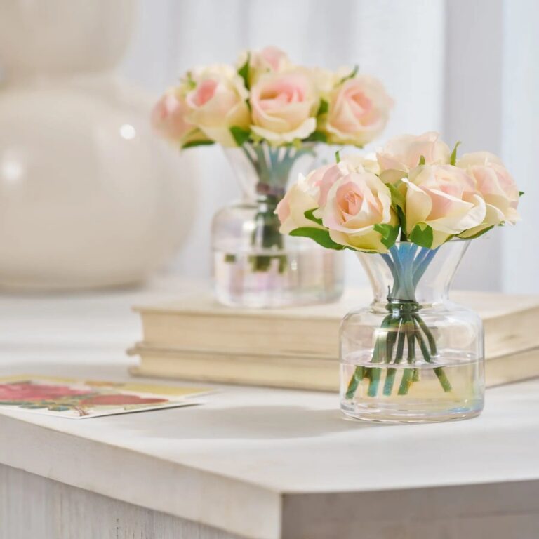
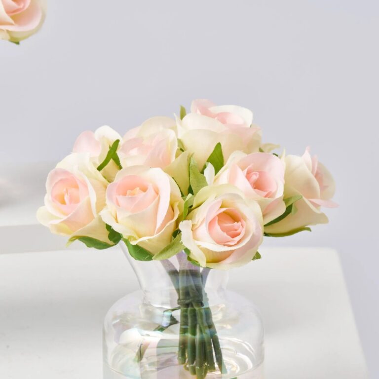
Faux Arrangement in Glass Vase – Blush
$99.00Faux arrangement. Measures 6″ L x 6″ W x 6″ H. Sold as a set of 2. A finished centerpiece that needs no watering.

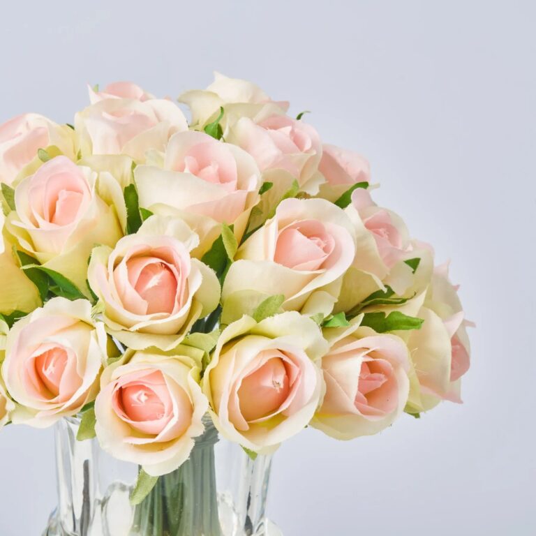
Faux Arrangement in Urn – Blush
$69.00Faux arrangement. Measures 8″ L x 8″ W x 9″ H. Set in clear resin illusion water. Styled for dining tables, mantels, and entryway consoles.
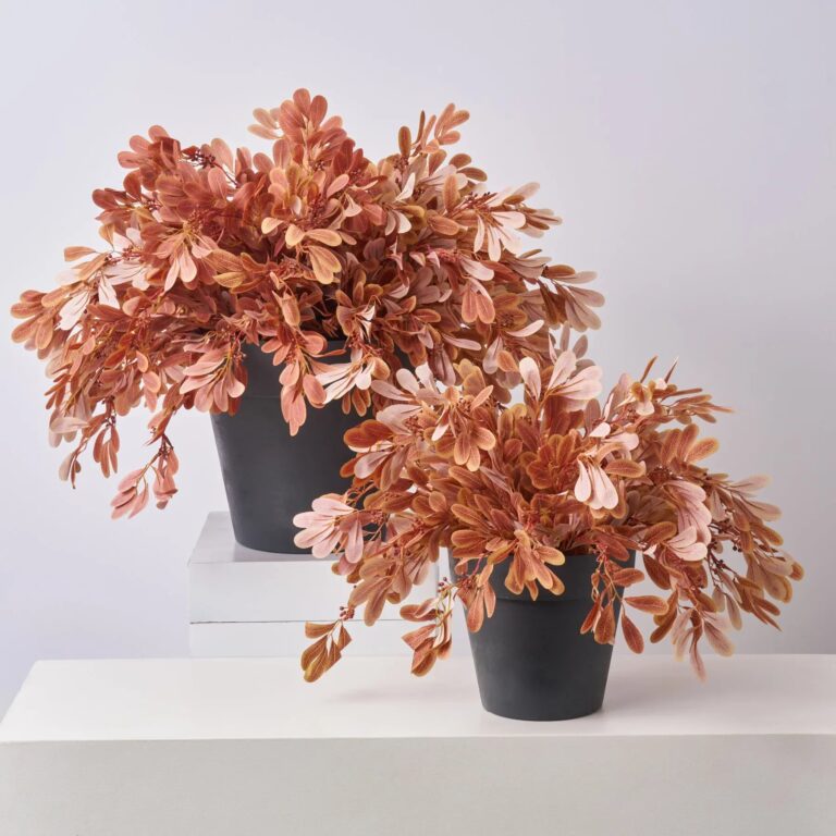
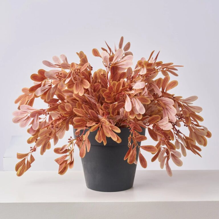
Foliage Faux Arrangement in Urn – Burnt Orange
Price range: $129.00 through $319.00Foliage arrangement. Offered in multiple colorways. Styled for dining tables, mantels, and entryway consoles.
Wedding work organized by palette: blush, burnt orange, dusty blue, sage and the full color-collections axis. Each collection coordinates bouquets, attire flowers and decor in one tone family, so the palette decision is made once and carried everywhere.
Quick answer: 5 palettes organize the line — blush, burnt orange, dusty blue, sage, and full color collections — each carrying bouquet, bridesmaids, boutonnieres and decor in one colorway. Lock the palette from a fabric swatch first, order one test stem of each before packages, and hold the second color at half saturation.
The Wedding Palettes
Blush Wedding Flowers
The soft romantic read — blush peonies and roses warmed with ivory and champagne, from the bridal bouquet to the head-table run.
Burnt Orange Wedding Flowers
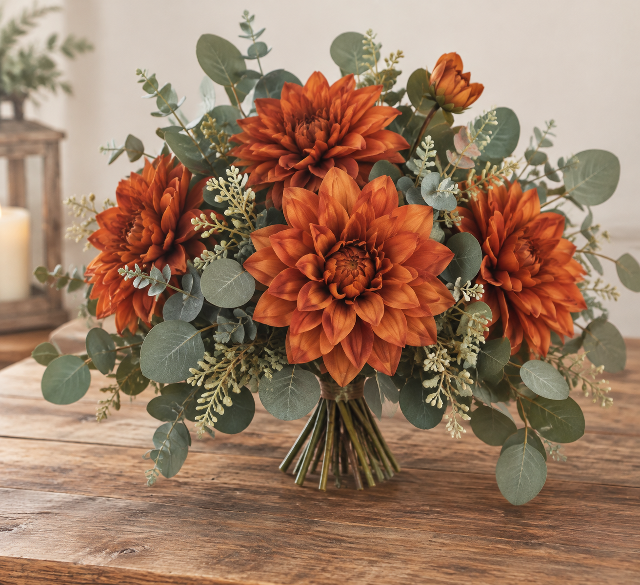
The fall signature palette, carried through every role of the wedding: burnt orange ranunculus and dahlias with cream and terracotta companions, from the bridal bouquet to the arch swag.
Dusty Blue Wedding Flowers
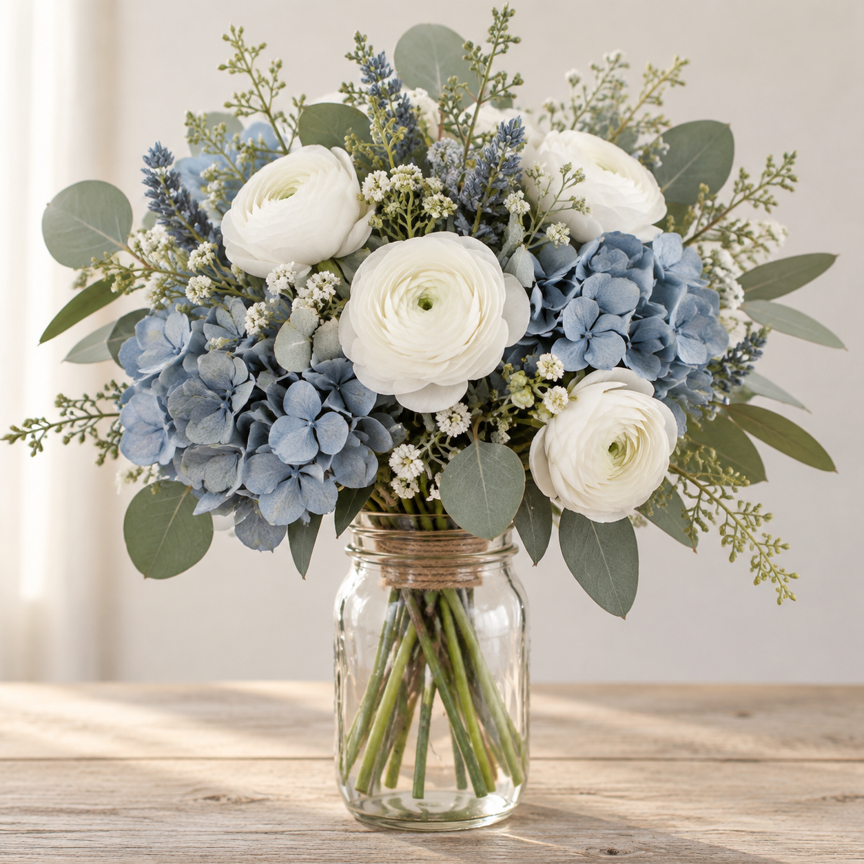
The cool neutral that flatters every skin tone in photos — dusty blue hydrangeas and delphiniums softened with ivory and sage, from the bridal bouquet to the head-table run.
Sage Wedding Flowers
The garden base palette — sage greenery as the main character, not the filler: olive branches, eucalyptus and jasmine softened with ivory blooms, from the bridal bouquet to the longest garland run.
Wedding Color
Pick the palette before the pieces. Each color collection carries the whole wedding in one colorway — bridal and bridesmaid bouquets, boutonnieres, corsages, arch pieces and garlands, matched on one dye batch per order.
How to Lock a Wedding Palette
- Start from a fabric, not a flower.
The bridesmaid dress or the venue drapery is the fixed point. Its tone names the collection; the flowers follow.
- Pick the second color at half saturation.
Blush pairs with sage, dusty blue with cream, burnt orange with taupe — the two-color combinations that work are documented per collection page.
- Order one stem of each before the packages.
A two-stem test against the fabric settles tone faster than any screen. Packages in the confirmed colors follow.
The Meanings Couples Shop By
Ask a florist guide what each color says at a wedding and the same short dictionary comes back — red for true love, pink for affection, yellow for cheerfulness, purple for elegance, with white and cream carrying the traditional purity-and-unity read. Meanings do not decide a palette, but they explain why some tones feel "right" for a vow exchange and others read party-first. The practical use is in the accents: a single meaning-carried color inside a neutral base lets the bouquet say something without the whole wedding shouting it.
2026's Named Palettes, Translated to Pieces
Each year the design world names its palettes, and 2026's wedding crop runs warm and garden-grown: blushing berry, summer wildflowers, golden orchard, and buttercream lead the roundups. None of those names appears on a flower order — here is what each translates to in dye lots you can actually buy:
- Buttercream — warm whites and vanillas with no stark bright white anywhere: cream colorway stems across any collection, checked in daylight so the base does not split into two whites.
The "New Neutral" Move
Palette guides this year keep returning to one trick for shaking up a safe scheme: swap the neutral, not the color. Black becomes navy; brown becomes terracotta. In floral terms that is exactly the dusty blue and burnt orange collections — both built to sit where a neutral sits (under everything, arguing with nothing) while giving photographs more warmth than plain white ever does. If the bridal party's outfits already lock the neutrals, the swap happens in the greenery layer instead: sage-toned foliage in place of dark green reads as the same quiet update.
Frequently Asked Questions
Which wedding colors photograph best outdoors?
Saturated tones — burnt orange, deep burgundy ends of the collections — hold their read in full sun, where pastels can wash out. Golden-hour ceremonies flatter every palette; high-noon ones favor the deeper ends.
Can we mix two palette collections?
Yes, and the collections are built to — adjacent tones blend (blush into cream), contrasting ones accent (burnt orange against dusty blue). The per-collection pairing notes name the tested partners.
How do we keep colors consistent across bouquets and decor?
Buy within one collection. Each collection's items are built against the same tone reference, which is the entire point of organizing wedding flowers by color rather than by flower.